One of my favorite Jekyll Octopress themes is Michael Rose’s Minimal Mistakes.
It’s a very simple theme that can look amazingly professional with the right header images, is easily customizable, and has a responsive layout that can fit any screen size. Responsive themes are particularly important, now that most people use a combination of smartphone, tablet, and laptop daily.
I’ve modified it further for my personal use :
Home Page Mod
For some reason, this theme wasn’t set up to have a homepage with an intro description. All that we need to do is add a `` tag to the _layouts/home.html template, to allow content within index.md to be displayed as a homepage.
<div id="main" role="main">
  <div class="article-author-side">
    {% include _author-bio.html %}
  </div>
  <div id="index">
    {{ content }}
    <h3><a href="{{ site.url}}/posts/">Recent Posts</a></h3>
    {% for post in site.posts limit:5 %}
    <article>
Disable Author Image Circle Frame
By default, the author side image (on the left) is framed with a circle. However, since the logo of the Bibliotheca Anonoma is a square, this feature has to be disabled.
In _sass/page.scss, comment out the rounded clause from .article-author-side:
.article-author-side {
        display: none;
        .bio-photo {
                max-width: 110px;
//              .rounded(150px);
        }
Also comment out the rounded clause from .article-author-bottom, which is used on mobile:
.article-author-bottom {
        margin-bottom: 1em;
        @media @600px {
                display: none;
        }
        .bio-photo {
                float: left;
                margin-right: 25px;
                max-width: 100px;
//              .rounded(150px);
Disable Book-style Paragraph Indentation
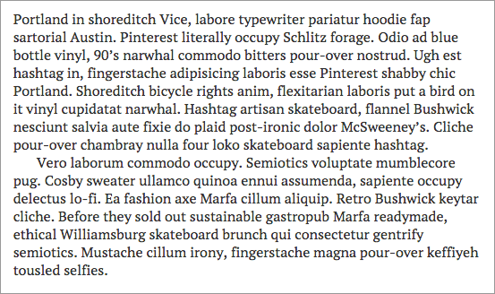
By default, in Minimal Mistakes, the margin below paragraphs has been removed and indent added to each. This is an intentional design decision to mimic the look of type set in a printed book or manuscript.

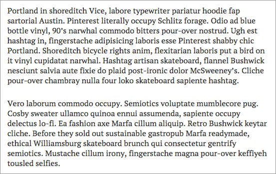
However, I wanted to have a more standard blog-style spacing with no indent, as shown below:

To disable the indents and add spacing between paragraphs change the following line in _sass/variables.scss from true !default to false like so.
$paragraph-indent: false;
Blog Post Gallery
While a text listing is simple and elegant for this blog, for things like the Bibliotheca Anonoma’s Compendium, we would prefer a sortable gallery, where header images are matched to descriptions in a grid.
(need to figure this out, grab from other Jekyll themes?)
